Theorie
Futura Bold Italic

Letters
Anatomie van een letter | Anatomy of a letter
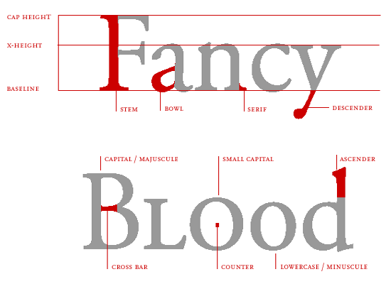
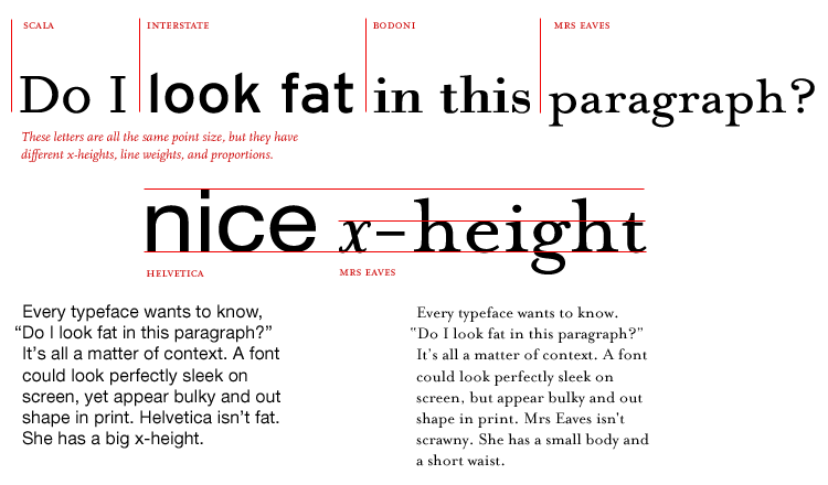
X-hoogte | X-height
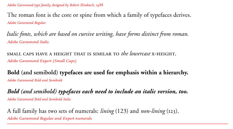
Genealogie van een letterfamilie | Genealogy of a font family
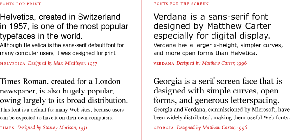
Nieuwe media nieuwe letters | New media new letters
bron | source: thinkingwithtype.com
Tekst | Text
Theorie: tekst
overzicht geschiedenis typografie:
http://www.papress.com/other/thinkingwithtype/teachers/type_lecture/history.htm
essay over rol van tekst:
http://www.papress.com/other/thinkingwithtype/resources/TextEssay.pdf
Allebei uit het *ng gave boek Thinking with Type van Ellen Lupton. Aanrader.
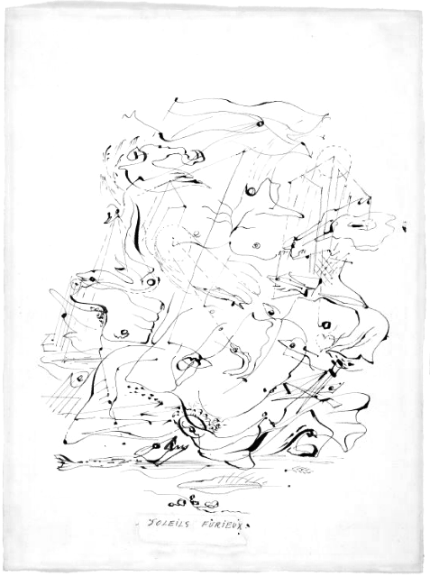
Nog meer lijnen | Even more lines
Bookilllustraties uit het Fin-de-siècle: Audrey Beardsley
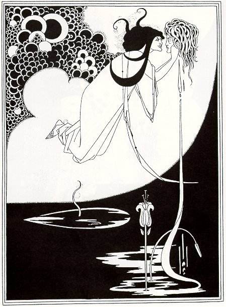
Eerder in de 19e eeuw maakten ze ook al lijntekeningen, b.v. John Flaxman.
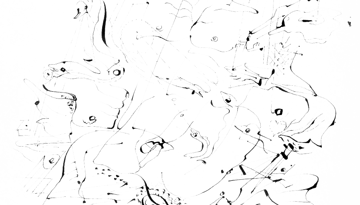
Dessin Automatique: André Masson
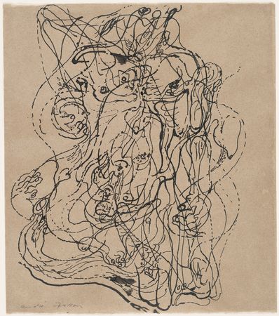
36 van zijn tekeningen op de site van het MoMA | 36 of his drawings on the MoMA Site.
Zie ook:
http://en.wikipedia.org/wiki/Surrealism
Jean Cocteau
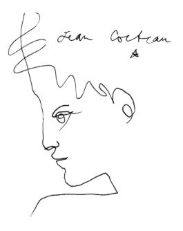
Lijntekeningen duiken ook op waar je het niet verwacht

En tenslotte
Voor de tweedejaars n.a.v. de vorige les, geheel rechtenvrij, liefdevol getekend met een yatate door een Franse natuurkundige:
http://en.wikipedia.org/wiki/User:Rama/Sexuality_drawings
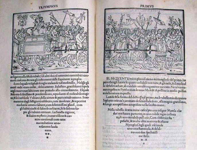
Dit deden ze met houtsnedes in 1499 | This is what woodcuts where used for in 1499
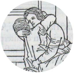
Het boek Hypnerotomachia Poliphili is waarschijnlijk een van de meest curieuze boeken die ooit gepubliceerd zijn. De Griekse naam kan vertaald worden als De strijd van Poliphilo om liefde, in een droom.
Het boek is gedrukt door Aldus Manutius in Venetië in december 1499. De schrijver van het boek is onbekend maar een acrostichon van de eerste letters van ieder hoofdstuk onthult de tekst: POLIAM FRATER FRANCISCVS COLVMNA PERAMAVIT. Vertaald betekent dit: broeder Francesco Colonna heeft Polia zeer liefgehad. In verschillende studies is het boek eerder ook toegeschreven aan Lorenzo de Medici en later aan Leon Battista Alberti en Aldus Manutius, de drukker, zelf.
Het boek is geschreven in afwisselende talen als Latijn, Grieks, Toscaans en Italiaans. Op veel illustraties staan ook Arabische, Hebreeuwse en Oud Egyptische (welke laatste overigens niet authentiek zijn) tekens. Het boek is een van de mooiste incunabelen (wiegedruken) ooit gedrukt volgens wetenschappers. Het boek valt allereerst op door de kwaliteit en de helderheid van de typografie in een tijd dat boekdrukkunst nog niet geperfectioneerd was. Het lettermateriaal dat gebruikt werd is speciaal voor Aldus Manutius ontworpen door Francesco Griffo uit Bologna.
Verder is de Hypnerotomachia voorzien van 174 houtsneden die veel van de figuren die in Poliphilos dromen voorkomen laten zien.
Zie ook de aan de in de Hypnerotomachia geweidde pagina van de Universiteitsbibliotheek van Glasgow en de pagina over de filmische beeldtaal op de site van MIT Press.
There were a few humanists who protested at the fatalism of astrology and proclaimed their belief in the power of man to be his own master, but all succumbed to the lure of the antique mysteries in which eternal truths were supposedly concealed. Notable literary and artistic expression is given to them in a strange rambling allegorical romance, Hypnerotomachia Poliphili (Love’s Strife in a Dream of Poliphilo), written in about 1460 by a Dominican friar, Francesco Colonna, and published with elegant woodcuts in Venice in 1499 (…). The combination of a darkly obscurantist text with typography of unprecedented clarity and illustrations in which forms are fully defined by a few confidently drawn lines could hardly be more characteristic of the period.
A World History of Art. Hugh Honour, John Fleming (Seventh Edition 2005)
Meer foto’s
Nog meer foto’s
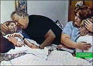
Na de zware kost vorige week van Benetton en de Aids-patient een heel ander. Dit is een Fascinerend artikel uit de Gaurdian over de foto’s die Jean-Paul Goude van Grace Jones maakte. De foto’s zelf zijn te vinden op http://www.madeinphoto.fr/.

Op laatstgenoemde site zijn overigens ook geweldige series te zien van o.a. Martin Parr en Guy Bourdin.
Waar we in de les niet meer aan toe kwamen
Karin mailde deze site door:
 (Ken je klassiekers :-))
En Tamara stuurde een link naar deze blog-post over deze beeldbewerker, op wiens site je ook making of’s kan zien.
n.a.v. de vraag van Maaike:
Foto-agentschappen
Volgens mij zijn dit de twee belangrijkste. Beiden in Amsterdam.
Blommers/Schumm, Elspeth Diederix, Gerco de Ruijter, Hans van der Meer, Ingmar Swalue, Jaap Scheeren, Kim Boske, Krista van der Niet, Marnix Goossens, Martine Stig, Raimond Wouda, Sema Bekirovic, Stig/Sassen, Victor Bergen Henegouwen, Viviane Sassen, Yvonne Lacet.
Anna de Leeuw, Chantal Spieard, Dominic Davies, Edo Kars, Ellen Kooi, Hans Heus, J.A.N, Marijke De Gruyter, Michel Olden, Niels Stomps, Rene Mesman, Richard Maas.
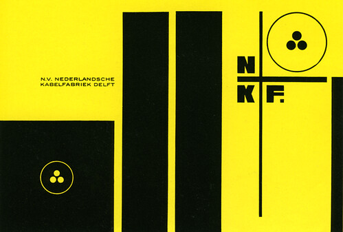
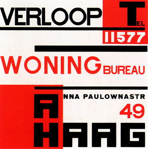
Graphic Design by Piet Zwart
http://www.flickr.com/photos/20745656@N00/sets/72157600164669111/. (Daar komen ook de onderschriften vandaan / Descriptions also taken from there)
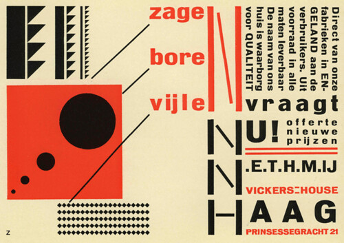
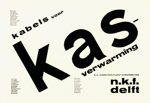
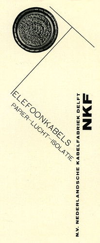
Piet Zwart’s design for an advertisement, Annonce NKF N.V. Nederlandsche Kabelfabriek, Delft 1924.

Piet Zwart’s post card advertisement for the Laga Co., Vioerenfabrikant, Vickers House, Dan Haag, 1924.
Once again, one of my Flickr friends helped with translation. Thank you so much it is aai! for catching the typo.
A Dutch film periodical cover designed by Piet Zwart 1932.
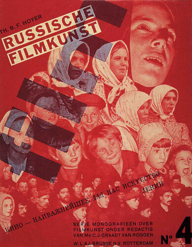
A Dutch film periodical cover designed by Piet Zwart 1931.
A Dutch film periodical cover designed by Piet Zwart 1931.
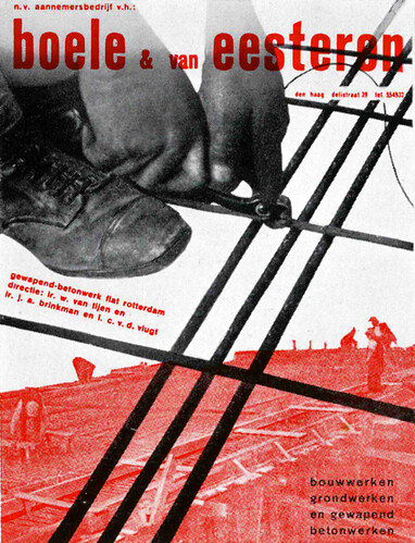
A Piet Zwart advertisement for a construction company used as the cover for de 8 Opbouw.
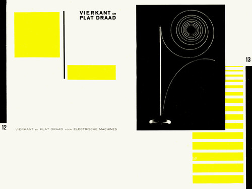
A double page layout for a catalog designed by Piet Zwart 1926. One of my favorite Zwart designs.
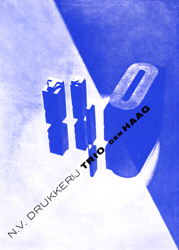
Design for a printing company by Piet Zwart 1930.
DaDa truly influenced this and this direction truly influenced how we see layout today. It was practically unheard of to use this type of visual in the time period just after WWI.
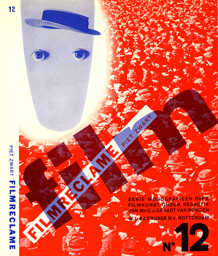
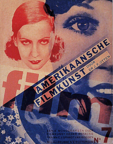
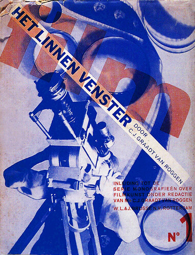
A book jacket for a series of monographs on films designed by Piet Zwart 1931.
An advertisement designed by Piet Zwart 1930.

A brochure for air-mail designed by Piet Zwart about 1930.
He took typography out of the nineteenth century and created design in keeping with the DaDa, DeStijl and Futurist movements, and the new industrial age of Europe. He was truly a pioneer of contemporary graphics.
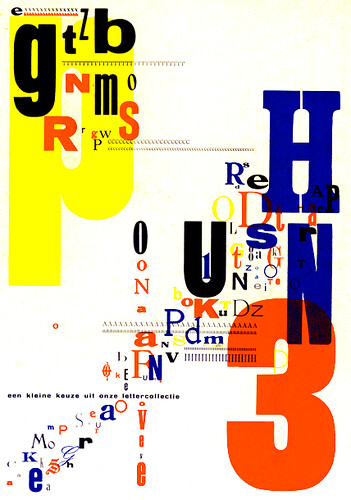
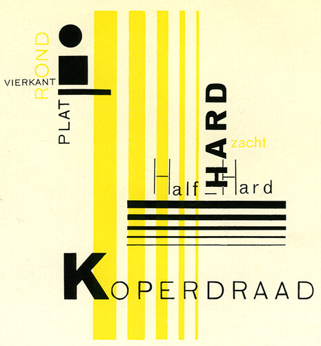
I may be wrong but I think that this is a title page for a type specimen book designed by Piet Zwart 1930. I also think that he did most of his own photography.
I think this is the title page of a brochure for broadcasting station Scheveningen designed by Piet Zwart 1928.
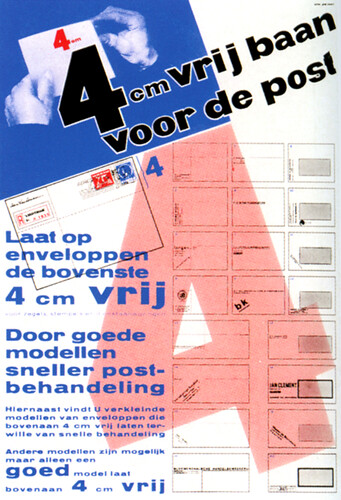
Poster for Netherlands PTT, designed by Piet Zwart 1934.
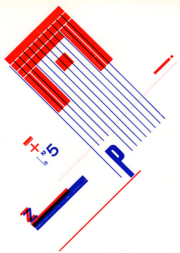
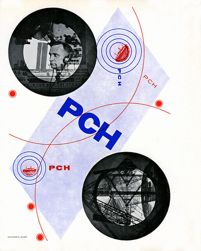
I’m not sure about this. I know that it was designed by Piet Zwart 1925, but I just don’t know what it is.
Advertisement designed by Piet Zwart 1929. This layout reminds me of a George Rickey sculpture.
Once again I am indebted to leonbuijs for the translation on the German work that I thought was Dutch. Thank you leonbuijs for catching my errors.
Designed by Piet Zwart 1925,
Catalog cover designed by Piet Zwart 1926.
Piet Zwart was never a member of De Stijl as far as I know, although he knew and respected the people involved in the De Stijl movement. He went his own way, which was an application of his ideas and principles in the very commercial, tough, working world of advertising art.
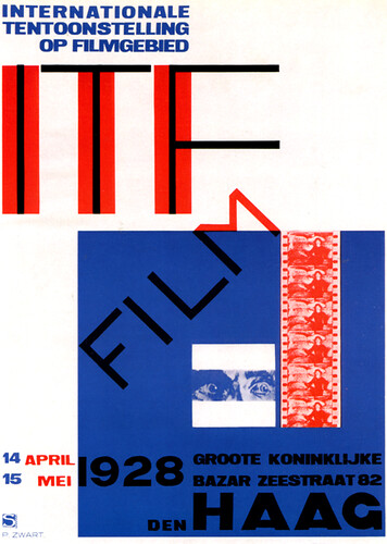
Film poster designed by Piet Zwart 1928. That’s a long time ago, the same year that both Wim Crouwel and I were born.
I have to be careful that I don’t put too many Piet Zwart graphics on here, but I dearly love his work.
Poster designed by Piet Zwart 1923.

Essays over nu en digitalisering en de ontwerppraktijk
Lees deze essays.
Over design en computers:
Ambition/Fear
http://www.emigre.com/Editorial.php?sect=1
By Zuzana Licko and Rudy VanderLans
Emigre 11 1989
Over de rol van de ontwerper in een transmediale praktijk:
Birth of the User
http://www.elupton.com/index.php?id=38
Ellen Lupton
uit: Thinking with type, 2004
Kijk naar video’s
Bekijk de video op http://www.apple.com/pro/profiles/surface2air/ Het is een reclame, maar wat interessant is om te zien is hoe een klein bedrijf wereldwijd kan opereren door de uitvoering van zijn ideeen in eigen hand te houden. Digitale technieken zijn hier niet een obstakel, maar juist de tool die ze nodig hebben om zo doortastend te opereren. Ook interessant: de vanzelfsprekendheid waarmee ze meerdere programma’s door elkaar gebruiken.
Facultatief: bekijk http://www.hillmancurtis.com/index.php?/film/watch/milton_glaser/. Dit heeft niet zozeer met digitale technieken te maken, maar des te meer met de beroepspraktijk—een bejaarde designgrootheid vertelt.