Fotomontage | Photomontage
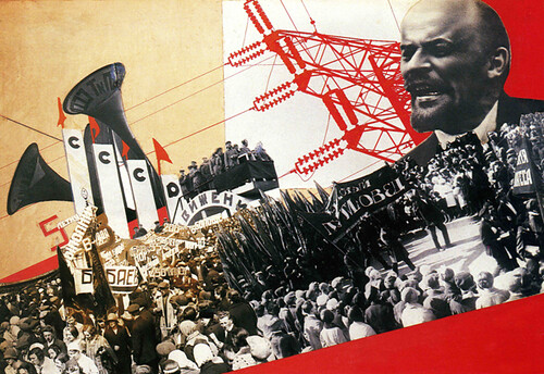
Inside double page spread from “The Results of the First Five-Year Plan” designed by Varvara Stepanova, Russian Constructivist 1932
Fotomontage werd voor het eerst toegepast in de dada en constructivisme bewegingen van de jaren twintig. De constructivistische kunstenaars waren nauw betrokken bij de socialistische revolutie in Rusland, en vroege Sovjet-propaganda behoort tot de eerste ontwerpen die de radicale vormtaal van de avant-garde gebruiken in massacommunicatie. In Nederland worden deze technieken toegepast door vormgevers van de Nieuwe Zakelijkheid, zoals Piet Zwart en Paul Schuitema.
Photomontage was pioneered by the Dadaist and Constructivist movements of the 1920s. Artists of the latter movement were strongly involved with the socialist revolution in Russia, and early Soviet propaganda was the first mass distributed design to use the radical visual language of the avant-garde. Similar techniques were employed by Dutch designers of the Nieuwe Zakelijkheid, like Piet Zwart and Paul Schuitema.
Fotografie als grafisch element | Photography as graphical element
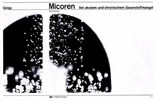
Foto’s als gestileerd grafisch element in design van de Zwitserse school. Dit is een extreem voorbeeld van een stijl die het grafisch ontwerp in de jaren 60 en 70 sterk beïnvloedde. De fotografie die in zulke ontwerpen gebruikt wordt is vaak zwart-wit en hoog contrast.
Photographs as stylised graphical elements in Swiss Style design. Though not always as extreme as these examples, the illustrative use of high contrast black and white photography became very common in post-war modernist design.
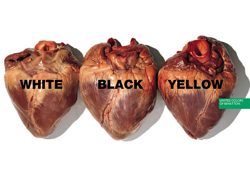
Fotografie is inhoud | Photography becomes constitutive of meaning
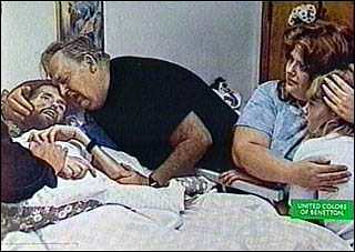
De ontwerper van de Benetton posters in de jaren 90 is een fotograaf, Oliviero Toscani. Wat fascinerend is, is dat hij in de campagnes afwisselend gebruik maakt van nieuwe foto’s en bestaande foto’s. De foto van de stervende aids-patient was oorspronkelijk zwart-wit, zie hier.
Fotografie krijgt in de jaren 80 en 90 een veel meer inhoudelijke rol dan daarvoor in communicatie het geval was.
In these designs by Oliviero Toscani for Benetton, pictures take on a far more conceptual role. They are constutive of the meaning of the design, with the text being of minimal importance.
Toscani himself was known as a photographer, as opposed to a designer. What is fascinating is that in these campaigns he combined new images he photographed with existing images, sometimes simply using them, and sometimes appropriating them into a different visual language. (The picture of the dying aids patient was originally black and white, see here). That the campaigns manages to maintain a consistent brand image is quite an accomplishment.
Fotografie is Typografie | Photography is Typography
David Carson:
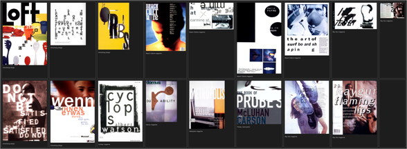
Pioneers in designing on the computer grijpen terug op de beeldtaal van de vooroorlogse avant-garde.
Pioneers in designing on the computer find inspiration in the visual language of the historical avant garde.
Substance:
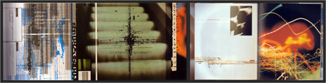
Maar de computer maakt ook een beeldtaal mogelijk die met traditionele technieken nooit tot stand had kunnen komen, waarbij typografie en fotografie in elkaar overvloeien.
But the computer also enables a visual language which would have been impossible to create with traditional techniques. Typography and Photography merge.
Opdracht | Assignment
Ik vond het moeilijk om een recent voorbeeld te vinden van een grafisch ontwerp dat fotografie op een interessante manier toepast. Zoek een voorbeeld van ontwerp uit de laatste twee jaar waarin je vind dat fotografie gebruikt wordt op een manier die je aanspreekt. Mail dit naar mij.
Mail me a picture of a recent design in which you think photography is being used in an interesting way.
Laat een reactie achter